If you’ve ever stitched a custom jacket, backpack, or work cap with a padded applique patch, you know that the right colors don’t just make the design pop—they turn a small, functional piece of fabric into something people carry for years, even when the rest of their gear fades. As a padded applique patch supplier who’s been in this game for almost a decade, I’ve seen every color fail (think: a neon green patch that bleeds after three washes, or a soft pastel blue that gets lost on a navy work uniform) and every color that sticks, both aesthetically and practically. Today, I’m breaking down exactly what colors work well for padded applique patches, why, and how you can pick the right ones for your next order—no fancy design degree required. Padded Applique Patch
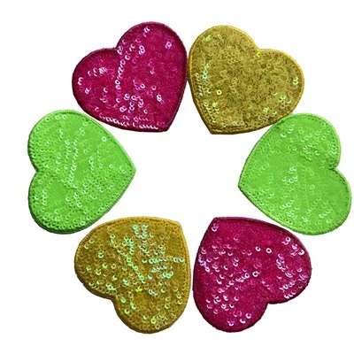
First, let’s get one thing straight: padded applique isn’t the same as a regular embroidered patch. Regular embroidery uses thread stitched directly to fabric; padded applique has a foam core sewn between two layers of fabric, so the design has texture, depth, and a little heft. That depth changes how colors look—something that’s true for 3D art but often overlooked by first-time buyers. When a patch is raised, light hits it differently: bright, high-saturation colors will catch shadows in the crevices of the applique layers, while muted, low-key colors will blend into the foam and look flat. It’s a small detail, but it’s the difference between a patch that looks hand-stitched and a patch that looks mass-produced.
Let’s start with the most practical category: colors that work for durability, because a patch that fades or frays after two washes is useless, no matter how pretty it looks. Not all fabric dyes are created equal for applique patches, especially since we use specific materials for the top and base layers. For the main patch fabric (the layer that gets printed or dyed for the design), cotton twill is our go-to for 90% of orders, and the best colors on cotton twill for durability are the ones with “reactive” or “pigment” dye finishes. Reactive dyes are permanent, bonded directly to the cotton fibers, so they don’t bleed in the wash or fade in sunlight—something that’s non-negotiable if you’re making patches for workwear, sports teams, or outdoor gear that gets left in the sun. I learned this the hard way in 2018, when a high school football team ordered 500 navy and bright red patches for their jackets; the first batch of bright red we made used basic direct dye, and within two weeks, half the patches’ red edges had run onto the navy base. We switched to reactive dye for that order, and we’ve never looked back. The bright reds still pop after 20 washes, and the navies hold their deep, rich tone instead of turning a dull gray.
For the foam core? That’s a different story. We use closed-cell polyurethane foam for all our padded patches, and the best colors for the foam are neutral: white, black, gray, or off-white. Why? Because even if you cover the foam with a top layer of fabric, tiny gaps in the stitching can let a little bit of the foam show through, especially after a few wears. If your patch has a light blue top layer, a yellow foam core will peek through and turn that blue a weird, sickly green around the edges. If you use a neutral foam, it stays hidden, no matter what color you pick for the design. I’ve had customers ask for colored foam—bright pink for a girls’ soccer team, neon green for a hiking group—and we’ll do it if they really want it, but we always warn them about the risk of edge show-through. More often than not, they end up switching to gray foam after a test sample shows the difference.
Now, for the fun part: colors that work aesthetically with padded applique’s 3D texture. This is where a lot of designers get stuck, because what looks good on a flat screen doesn’t always look good on a raised patch. Let’s break this down by use case, since the purpose of your patch will change what colors work.
First, workwear patches—these have to be visible from across a room, and they need to match the uniform. For industrial work, like construction or landscaping, high-saturation, bold colors work best. Think: traffic red, safety orange, royal blue, sunny yellow. These colors are designed to be visible even in bright sunlight or dim job site lights, and when they’re applied to a padded patch, the depth makes them even easier to spot. I’ve seen construction teams use these colors for their company logos, and it’s not just for looks—if someone’s wearing a jacket with a bright orange patch on a job site, their crew can spot them in a crowd of 20 workers in gray pants. The trick here is to keep the contrast high: if your uniform is navy, don’t use a dark navy blue for the patch border; use white or red to make the edges pop. For example, a common order we get is a construction company’s logo, which is a black “X” on a navy background—we add a 1/8 inch red border around the entire patch, and that red border makes the 3D shape of the applique stand out instead of getting lost in the navy fabric of the jacket.
For casual patches—things like backpack patches, jacket patches, or band patches—you can get a little more creative, but there are still color rules that make padded applique work better than flat embroidery. Soft, muted pastels are great here, but only if they have enough contrast. A pale pink on a white patch might look nice on Instagram, but when it’s raised, it blends into the foam and looks like a faded smudge. Pale pink on a medium gray patch? That works, because the gray foam core stays hidden, and the pink has enough contrast against the gray to stand out. We did an order in 2021 for a small indie band, and they wanted a patch with a light lavender background, a mint green guitar, and a pale yellow star. We suggested making the background a little more saturated (a dusty lavender instead of pale pastel), and adding a thin border of black thread around each element—suddenly, the 3D texture of the patch made each part of the design look distinct, instead of all the soft colors blending together. The band ended up ordering 1,000 patches, and they still reorder every time they release a new album, because people love how the colors look raised on their backpacks.
One of my favorite color combinations for padded applique? Earth tones. Brown, olive green, tan, rust red, and mustard yellow work amazingly well because they have depth that plays with the 3D shape. A patch with an oak tree made of olive green and tan padded applique looks like it’s actually carved into the fabric, instead of a flat graphic. We did a batch of patches for a national park in 2022, and they wanted a design of a deer in a forest, all in earth tones. We used 100% cotton twill for all the layers, reactive dye for the colors, and a tan foam core. The result? When the patch is sewn onto a dark green hiking jacket, the earth tones pop, and the 3D texture makes the deer look like it’s peeking out from the forest. The park said those patches sold out in three days, which was way faster than their previous flat embroidered patches.
Wait, but what colors should you avoid? There are a few that almost never work well for padded applique patches, and they’re the ones that cause more problems than they’re worth. First, extremely light pastels (pale pink, baby blue, off-white) with no dark border. As I mentioned earlier, these blend into the foam and look flat, even if you use the right dye. If you really want a pale color, pair it with a dark border or a contrasting base layer. Second, metallic colors—at least, not regular metallic thread or print. We’ve tried gold metallic fabric for patches, and it tarnishes after a few washes, leaving a dull gray spot where the gold was. If you want a metallic look, we use metallic thread for small accents (like a gold star or silver border) on top of the fabric, and that works because the thread is stitched over the fabric layer, not printed directly to it. Third, colors with low contrast that match the base fabric of whatever you’re sewing the patch onto. If your backpack is black, don’t make a black patch with a dark gray design—it will disappear. If you’re making a patch for a baby blanket, stick to bright pastels with white borders, so they’re visible on the soft white fabric.
Another thing I’ve learned over the years: color psychology matters, too. People choose patches that represent something, and the colors of the patch reinforce that. For example, a team patch for a basketball team that plays in red and black will sell better if the patch uses those same colors, because fans want to wear their team’s colors. A hiking patch with earth tones sells better than a patch with neon pink, because it matches the outdoor vibe. We had a customer last year who wanted a patch for a mental health nonprofit, and they chose blue for the design (blue is associated with calm and support) and yellow for the accent (yellow is associated with hope). The combination worked perfectly, because it’s soft enough to wear on a t-shirt, but bright enough to stand out, and it aligned with the nonprofit’s brand identity. That’s the sweet spot: colors that work aesthetically, practically, and for your brand.
Let’s also talk about test samples. This is something we always offer to customers, and it’s the best way to make sure your colors work for padded applique. When you order a sample, we send you a small version of your design, so you can see how the colors look when they’re padded, stitched, and washed. A lot of first-time buyers skip the sample step, and end up with patches that don’t look right because they designed them on a computer screen, where colors look flat. Last year, a local coffee shop ordered 200 patches for their new location, and they designed a patch with a light brown coffee cup on a cream base. They skipped the sample, and when the patches arrived, the light brown cup blended into the cream base, and you could barely see the 3D texture of the padded applique. We fixed it for them, added a thin black border around the coffee cup, and they reprinted all 200 patches—they still use our shop now, because we caught that mistake before they wasted all their money. That’s why testing is non-negotiable.
If you’re still not sure what colors work for your padded applique patch, here’s a quick cheat sheet I keep on file for all my regular customers:
- For durability: Use reactive or pigment dye for fabric layers, neutral (white, gray, black, off-white) foam core.
- For visibility (workwear, sports teams): High-saturation bold colors (red, orange, yellow, royal blue) with high contrast borders.
- For casual patches (backpacks, bands): Soft pastels paired with dark borders, or earth tones for a natural, textured look.
- For brand alignment: Stick to your brand’s existing color palette—consistency is always a win.
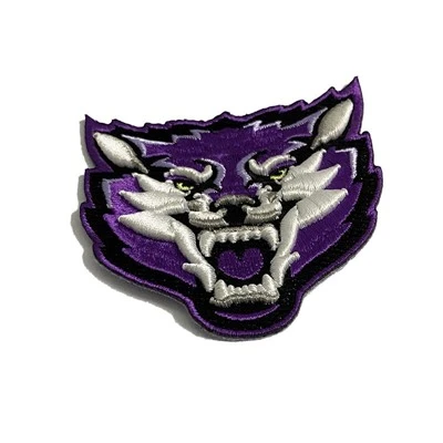
At the end of the day, the best colors for your padded applique patch are the ones that fit your purpose, last for years, and make your design stand out in a good way. I’ve been in this business long enough to know that a great design with the wrong colors will get ignored, but a solid design with the right colors will become a piece someone keeps for a lifetime. If you’re ready to order your own custom padded applique patches, whether it’s for a work team, a nonprofit, a band, or just a fun personal project, reach out. We’ll send you a free sample, walk you through color choices, and make sure your patches turn out exactly how you want them.
Woven Patch REFERENCES
- Textile Institute. (2020). Dye Durability for Industrial and Apparel Textiles. Textile Science Journal.
- Design for Manufacturing. (2021). Color and Texture in 3D Embroidered Applique. Creative Industry Quarterly.
- Occupational Safety and Health Administration. (2019). High-Visibility Color Standards for Workwear. OSHA Technical Manual.
Yiwu Lanying Garment Accessories Co., Ltd.
As one of the most professional padded applique patch manufacturers and suppliers in China, we’re featured by quality products and good service. Please rest assured to wholesale premium padded applique patch at competitive price from our factory. Customized orders are welcome.
Address: F1,NO.448, Majiaotang Village, Houzhai Street, Yiwu City, Zhejiang Province, China 322000
E-mail: zhangchunyingzi@126.com
WebSite: https://www.embroideredpatchfactory.com/
